#MakeOverMonday - The MBTI Explorer

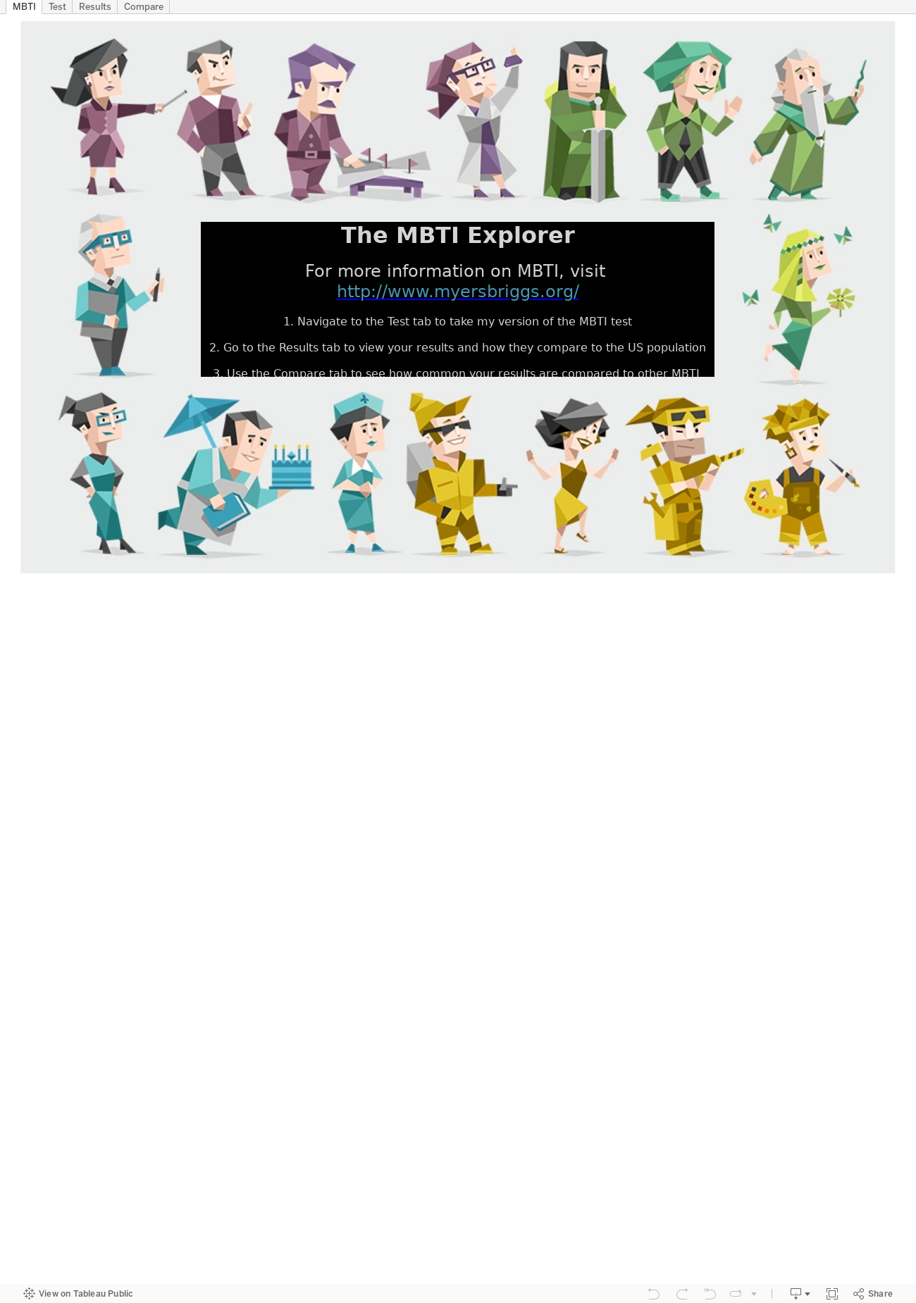
This week, it seems I did exactly what #MakeOverMonday tells me not to do and I went hog wild with my MBTI viz. I saw Andy Kriebel's entry over at his blog VizWiz and it got me thinking, "I'd like to see how my MBTI result stacks up in this view."

I created a make-shift test in Tableau based off the statements that define each of the types.

The users select a "Yes" or "No" answer based on whether they tend to agree that the statement applies to them or not.


Now for test results. Here's where I copied Andy a bit. I also added in a little indicator for how strong the users' test results lean in each type. Turns out I'm the type "INTP" as seen below.


To find out how common my type is against data from folks in the USA, I created a heat map. When the user clicks on the box that represents their personality type, it brings them to an external website to help them learn more about what their type means.


In the end, it was fun to use Tableau to act as a test form and show results from the test and analyze them all in one workbook.

#MakeoverMonday Women in the Workplace

Here's my attempt at a tablet (specifically for the iPad) dashboard as part of the #MakeoverMonday viz challenge.

Contest rules here and original source here.

The dashboard was built at 764x855 pixels, which is Tableau's default pixel size for an iPad Portrait view. It works well in both the Tableau app and also through the Safari or Chrome browsers.

Like my #MakeoverMonday viz last week, I used story points to help condense a few different views of the data. I use each point to focus on a specific type of chart and allow the end user to absorb the same information in different ways. Please use the comments section to let me know which chart is your favorite (and why).

Enjoy!


Click here to follow the live action on #MakeoverMonday

#MakeoverMonday - Facebook's Path to Sustainability

Here's my attempt at a mobile (specifically for the iPhone 6) dashboard as part of the #MakeoverMonday viz challenge.

Contest rules here and original source here.

The dashboard was built at 320x568 pixels, which seems to work well even when browsing this dashboard on my mobile Safari browser.

I used story points to help condense a few different views of the data.

Enjoy!


Click here to follow the live action on #MakeoverMonday

My #MakeoverMonday Viz

The challenge this week for #MakeoverMonday is to rethink the Tableau viz included in the CNBC article, The Victims of the 21st-Century Slave Trade and use its data to help turn it into a more meaningful visualization. I spent a few minutes figuring out the data, which was fairly simple but slightly confusing as to what exactly it meant. After reading the article, I understood the data was focused on the "Bureau of International Labor Affairs (ILAB) reveal[ing] that more than 136 products from 74 countries are produced by forced and child labor. These are products used by consumers worldwide every day." With that in mind, I came up with 3 questions to explore...

  1. What does the distribution of countries, identified by the ILAB, look like geographically? For a given tier, are there clusters of countries within certain regions?
  2. Are things getting any better? What do trends look like for the number of countries identified per region per year? Are there hot spots?
  3. Which countries per region are the greatest offenders of the slave trade? What does this look like by tier?

I set out to make a few visuals, figured out a few that I liked, and aligned them on a dashboard making every data point actionable to the rest of the data presented. This all took me about an hour. Here's my viz:

Click here to follow the live action on #MakeoverMonday