PELOTON

Anyone else secretly obsessed with Peloton and all the data they provide for working out?

Here's my custom Tableau dashboard I made utilizing DovOps Google App Script for handling/synchronizing my Peloton Data into Google Sheets and using Tableau Public's native web data connector to Google Sheets for automated updates. #GitHub #googlesheets

If you have any comments/questions or if there are any views you like/dislike, tweet me!

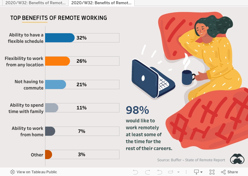
2020/W32: Benefits of Remote Work #makeovermonday

 In my first version, I converted the stacked bar into a donut chart generally not a best practice , using a color blind palette, and paired it with a table for easy consumption of the data.


I decided to make a second version, which I ended up liking a whole lot more because of how clean the rounded bar charts look.

IRON VIZ 2020 SUBMISSION: Good Night, Sleep Tight, Don't Let the COVID-19 Pandemic Bite

My Iron Viz submission for 2020: Good Night, Sleep Tight, Don't Let the COVID-19 Pandemic Bite

Mental Health #MakeoverMonday 2020 wk27

Bracket Challenge - Disney Songs

With my niece Evelyn turning 1 next week, we've been getting back into watching Disney movies and listening to Disney songs on Spotify, knowing that she'll get to experience them all for the very first time soon enough. That sparked a great debate... "What's the Best Disney Song Ever?"

To tackle this, we decided to send Cinderella to the Big Dance!

I put together a spreadsheet with our top 64 Disney songs and ranked them using Spotify play counts (or YouTube if not available on Spotify). I initially did this in Google Sheets because it was relatively easy to make a bracket there, but as a self-proclaimed "Tableau Wizard" I had to try it out in my favorite data viz application.

After...

  1. 63 set actions
  2. an image of a bracket I threw together in Excel and used as the background
  3. a heck of a lot of formatting and floating objects, and 
  4. a URL-action enabled song preview feature... 

It's now your turn to join in on the Big Dance and see if your favorite song is ready to have its own "Cinderella story" in my Tableau-enabled Bracket Challenge of Disney Songs.

Tweet at me or leave a comment to let me know what you think.

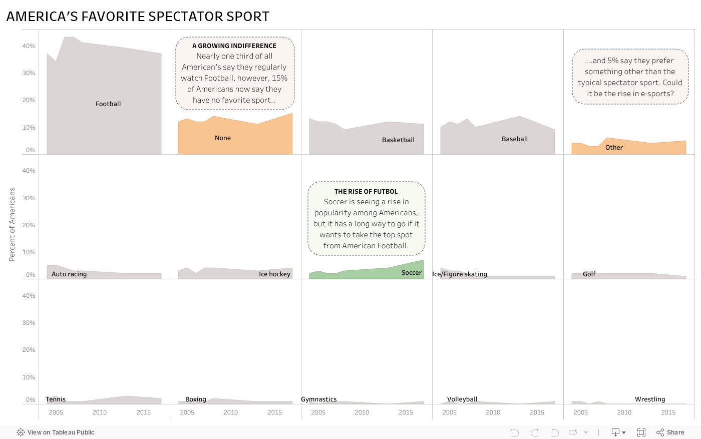
#MakeoverMonday - America's Favorite Spectator Sport

#MakeOverMonday - The MBTI Explorer

This week, it seems I did exactly what #MakeOverMonday tells me not to do and I went hog wild with my MBTI viz. I saw Andy Kriebel's entry over at his blog VizWiz and it got me thinking, "I'd like to see how my MBTI result stacks up in this view."

I created a make-shift test in Tableau based off the statements that define each of the types.

The users select a "Yes" or "No" answer based on whether they tend to agree that the statement applies to them or not.


Now for test results. Here's where I copied Andy a bit. I also added in a little indicator for how strong the users' test results lean in each type. Turns out I'm the type "INTP" as seen below.


To find out how common my type is against data from folks in the USA, I created a heat map. When the user clicks on the box that represents their personality type, it brings them to an external website to help them learn more about what their type means.


In the end, it was fun to use Tableau to act as a test form and show results from the test and analyze them all in one workbook.

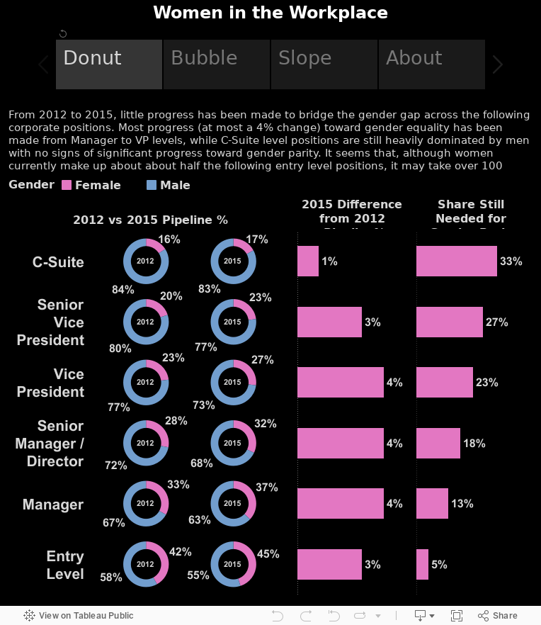
#MakeoverMonday Women in the Workplace

Here's my attempt at a tablet (specifically for the iPad) dashboard as part of the #MakeoverMonday viz challenge.

Contest rules here and original source here.

The dashboard was built at 764x855 pixels, which is Tableau's default pixel size for an iPad Portrait view. It works well in both the Tableau app and also through the Safari or Chrome browsers.

Like my #MakeoverMonday viz last week, I used story points to help condense a few different views of the data. I use each point to focus on a specific type of chart and allow the end user to absorb the same information in different ways. Please use the comments section to let me know which chart is your favorite (and why).

Enjoy!


Click here to follow the live action on #MakeoverMonday

#MakeoverMonday - Facebook's Path to Sustainability

Here's my attempt at a mobile (specifically for the iPhone 6) dashboard as part of the #MakeoverMonday viz challenge.

Contest rules here and original source here.

The dashboard was built at 320x568 pixels, which seems to work well even when browsing this dashboard on my mobile Safari browser.

I used story points to help condense a few different views of the data.

Enjoy!


Click here to follow the live action on #MakeoverMonday

My #MakeoverMonday Viz

The challenge this week for #MakeoverMonday is to rethink the Tableau viz included in the CNBC article, The Victims of the 21st-Century Slave Trade and use its data to help turn it into a more meaningful visualization. I spent a few minutes figuring out the data, which was fairly simple but slightly confusing as to what exactly it meant. After reading the article, I understood the data was focused on the "Bureau of International Labor Affairs (ILAB) reveal[ing] that more than 136 products from 74 countries are produced by forced and child labor. These are products used by consumers worldwide every day." With that in mind, I came up with 3 questions to explore...

  1. What does the distribution of countries, identified by the ILAB, look like geographically? For a given tier, are there clusters of countries within certain regions?
  2. Are things getting any better? What do trends look like for the number of countries identified per region per year? Are there hot spots?
  3. Which countries per region are the greatest offenders of the slave trade? What does this look like by tier?

I set out to make a few visuals, figured out a few that I liked, and aligned them on a dashboard making every data point actionable to the rest of the data presented. This all took me about an hour. Here's my viz:

Click here to follow the live action on #MakeoverMonday

Opinion: Stop the Hate

Stop The Hate

There are a lot of terrible things I hear on the news, but when I hear about school shootings like the Columbine shooting, the Sandy Hook elementary shooting, Virginia Tech shooting, or more recently the Umpqua Community College shooting in Oregon, a flurry of questions run through my head like:

  • Why did this happen?
  • How could we have let this happen?
  • Was there any motive?
  • What could have possibly caused this?
  • How can we work to prevent this from happening again?

More often than not, terrible events like school shootings are either a form or a product of bullying.

Bullying is a purposeful attempt to control another person through verbal, physical, or any other type of mental abuse.

I hope none of my readers have been a victim of bullying and I also hope none of my readers have bullied anyone else, because we should all know that we are loved and should feel secure, protected, accepted, and confident in anything we do. Nobody else, especially any bully, should ever make us feel otherwise.

Unfortunately, bullying is part of our reality and it's hard to escape whether we are at school, on a sports team, at work, or even with friends and family.

I'm writing this today to tell you that bullying is not ok in any way shape or form. We should all unite to stop bullying. We should all feel inspired to be ambassadors of peace and tolerance. And we should all lead by example in order to prevent bullying in the future.

How do we do that? Stay educated on what's happening. Let's take a look at some facts…

Bullying occurs in many places, to many people... it can happen in schools, which would seem the most common place for bullying given the following statistics from a 2010 study by the National Education Association:

  • 160,000 or about 15% of children miss school every day out of fear of being bullied
  • 71% of students report bullying as an ongoing problem
  • 1 out of every 10 students drop out or switches their school due to repeated bullying
  • 1 in 7 students through k-12 is either a bully or has been a victim of bullying
  • The highest instances of bullying come in 4th-8th grade, in which 90% were reported as victims of some kind of bullying
  • 282,000 students are reportedly attacked in high schools throughout the nation each month

As children grow, they must learn to socialize with their peers and understand who their leaders are. It may seem to some that their children are innocent, so no harm could possibly be done by them, but this is often not the case. Remember the old saying, "monkey see, monkey do?" Bullying occurs in many other places we should be aware of. It can happen in workplaces, homes, playgrounds, the military, nursing homes, and other places both we and our loved ones live and work in everyday.

Bullying has no age boundaries. It can occur between a number of groups - adults to children, children to adults, adults to other adults, kids to other kids.

Bullying can occur for many different reasons. Here's why some people are bullied:

  • Cultural differences - especially those cultures obsessed with winning, power, and violence
  • Institutional - home, school, workplace having poor standard for how people treat each other
  • Social issues - acting out gets more attention than courtesy and civility, leading to jealousy or envy
  • Family issues - children growing up in homes that are not truly loving and accepting
  • Personal history of the bully - those experiencing social rejection may pass on the feeling to others
  • Having power - with great power comes great responsibility, and power is misused and abused more often than not
  • Victims of bullying - responding with aggressive, condescending, annoying, or other negative types of behavior

While actively participating as ambassadors for peace and tolerance, here's what we should look out for:

  • Physical – hitting, kicking, pinching, punching, scratching, spitting or any other form of physical attack. Damage to or taking someone else’s belongings may also constitute as physical bullying.
  • Verbal – name calling, insulting, making racist, sexist or homophobic jokes, remarks or teasing, using sexually suggestive or abusive language, offensive remarks
  • Indirect – spreading nasty stories about someone, exclusion from social groups, being made the subject of malicious rumours, sending abusive mail, and email and text messages (cyber bullying).
  • Cyber Bullying – any type of bullying that is carried out by electronic medium. There are 7 types including:
    • Text message bullying
    • Picture/video clip bullying via mobile phone cameras
    • Phone call bullying via mobile phones
    • E-mail bullying
    • Chat-room bullying
    • Bullying through instant messaging (IM)
    • Bullying via websites

To note, many victims of bullying feel the need to retaliate and become bullies themselves. It's important to treat everyone with the love and respect they deserve. We must learn to project ourselves out into the world as we would hope to receive it.

As we all know, this behavior can become extreme and lead to horrific events like school shootings. In fact, 61% of students believe school shootings are due to the shooter being a victim of bullying in the past, either at home or at school. A horrible statistic is that 1 out of every 20 students has seen a student with a gun at school. If a student feels compelled to bring a gun to school to feel safe, to feel cool, to feel intimidating... imagine what life must be like outside of school for that student?

I hear a lot of people from older generations talking about how soft we are as a society these days; about how much harder they had it when they were young. And sure, maybe our youth will benefit from a bit of tough love now and then, but aren't we, as adults and as their leaders and heroes, supposed to draw a fine line between proper social discipline and bullying? For those who want to establish themselves as the alpha in the group, just know that your anger and aggression is sending everyone else around you into fight or flight mode. Chances are, those who initially fight will eventually be drawn away from you, while those who flee because they can't or don't want to fight, may take that same anger, multiply it, and project it out to others. This sure as hell is neither an ideal solution nor a sustainable model.

I think the answer is simple, but the task is large. Everyone reading this and everyone in this world needs to embody a greater sense of love. This isn't any new revelation either... "love your neighbor as yourself" and "do unto others as you would have them do unto you." Unfortunately, I find that those who love to quote the good book are the worst offenders of its teachings in their daily lives due to the contingency of a simple confession to wash away these sins and the cheap insurance to simply "forgive and forget."

If you spot anyone being bullied, don't turn your head and walk away, speak up and stop it! If you see it in the workplace, contact your manager or HR department. Encourage bullies and victims of bullying to seek counseling. We are all on this planet together, we all deserve safety, belongingness and love, and we can achieve it by saying no to bullying. Let's work together to stop the hate!

Star Wars: A Film Review

Well this was fun!

Tableau Public recently put up some Star Wars data for us Tableau Jedi's to play with. Through Tableau's web data connector, I was able to connect to their Star Wars API and pull down some data, along with adding some of my own, to create a neat little Star Wars film review dashboard.

The idea here is to click on a film title, like A New Hope at the very top. After that's done, the poster for the selected film will appear along with the opening crawl that we all know and love from the Star Wars movies. This should provide a general sense of what's going on in the movie, so the next visualization covers the hottest words throughout the movie script. There must be a lot of action around words like "Luke" "Han"and "Death Star" in A New Hope! Now that we have an understanding of what the movie is all about, the next section at the bottom left deals with how 3 popular film critic sites have rated the movies. It's clear that Episode 4 is very popular, but it's also very well rated by Rotten Tomatoes, IMDB, and Metacritic.com. Finally, to understand why the movie is so popular, or unpopular as is the case with the first 3 movies, the star scatter plot on the bottom right shows who directed and produced it. It's pretty clear, after clicking around a bit, that movies produced by Rick McCallum tanked with the critics. So go ahead, click around, and get pumped for the amazing reviews The Force Awakens has already built up!

Harry Potter and the Tableau School of Word Clouds and Data Vizardry

What is a word cloud?

Oh, yes, that's when I take a big bite of alphabet soup and then spit it out because it's way too hot, right? No... no, not really. No. Not at all, actually. A word cloud provides a visual representation of text data where unique words are arranged in shape or clustered together and sized by their number of occurrences or importance. The viewer of a word cloud should gain a quick understanding of how many unique words exist in the text data, quickly pull out important words and see what categories may exist among the unique words.

Word clouds are a form of data visualization. They have been used since the 1990's as a means of site navigation for keyword metadata (tag clouds) to help people find the pages they're searching for on a website. Today, word clouds have been popularized to include any form of text data and there are many websites that provide word cloud services. What I found after looking through most of the word cloud websites is that the output is typically delivered in static form. In my words, "I have all this cool text data, but all I get from it is a lousy static picture?!?" Maybe that works for most people, but I want more from my text data.

Let's say I got my hands on some pretty cool text, or rather, "the most freaking amazing text," by my wife's standards. That's right, I have "Harry Potter and the Chamber of Secrets," from the 2nd novel in the 7 novel series, Harry Potter, written by the wonderful JK Rowling, in a text file. And let's also say I wanted to turn that text data into a word cloud to help me see what unique words are used and which of those unique words are used the most throughout the story. I could easily go to one of the top searched word cloud sites and create one for free, if only for this purpose.

Heck, I could even go to another top searched word cloud site and create one that removes any of the commonly used words and punctuation marks in the English language e.g. and, is, so, him, should, ?, !, (, ), etc. These are called "stop words." Some word cloud websites provide the option to choose which words or characters to suppress in a word cloud so that the word "the" isn't taking up half the word cloud like in the image above. Now, in the image below, it can be seen that the most used word throughout the book is clearly "Harry" with "Ron" and "Hermione" trailing behind.

But these are only static images and my options for what I can do with the word cloud are limited. What if I had more questions that I needed my word cloud to address? What if I needed my word cloud to be interactive? What if I wanted to host my word cloud online so that others could interact with it?

To solve these problems, I turned to Tableau.

But first I had to get a dataset, which was essentially an entire book in the form of a text file, shaped and ready to go in Tableau. For that, I busted out my wizarding wand and used some notepad++ magic along with a keen eye as I parsed out the data. What I wanted my data to ultimately look like was a 2 column table. One column would contain all the words used in the book and the other column would contain the sequence of each word used throughout the book. I also made all words lowercase so they'd be easier to read in the word cloud.

Once I had the data prepped and saved as a text file, I plugged the data into Tableau and built my first word cloud. As can be seen below, this word cloud displays all unique words or characters contained in the file, except for any unique word or character occurring less than 10 times. I figured any word occurring less than 10 times may either be a corrupt word or one that just isn't very interesting or relevant to the story - it also helps dashboard performance. Each word is sized and color-categorized according to its number of occurrences throughout the book. I've provided a way to filter the quantity of unique words displayed in the word cloud by a minimum and maximum number of occurrences. I've also enabled a word search function where one or more words can be shown while filtering out all non-matching words from the visualization.


If I go back to my data connection and left join my own, custom made Stop Words data set to it, I can easily filter out any of the commonly used words I do not want to see in my word cloud. Here, we can see that words like "the" which occurs 4,092 times throughout the book, is filtered out, along with other commonly used stop words like [and, in, a, his, of, said, he, to, etc.] while the newly reigning word featherweight champion of the book now clearly becomes "harry." This word cloud has the same ability to filter, search, and easily see the word occurrence groups.


Ok, great, I built an interactive word cloud. What about all those other questions I have? Building a word cloud dashboard would allow me to take advantage of the unique words and also the word sequencing that I have built into my text data through additional visualizations and dashboard actions. This is helpful because a word cloud is not typically the best data visualization to use if I want real insights from my data, so the dashboard below provides 3 additional views to the word cloud:

  1. A word bubble (Word Bubble! at bottom left) easily helps me get a sense of the quantity of each unique word in a given word occurrence group.
  2. A vertical bar chart (Words Used per Chapter at bottom middle) helps break down each chapter by the unique words contained within it.
  3. A horizontal bar chart (Most Used Words at bottom right) quickly shows words having the most to least occurrences.


And when these 3 additional views accompany the word cloud, I can now apply dashboard actions to click on different data points and answer questions like:

How often, per chapter, does the word Harry occur compared to all other words in the chapter? In fact, Harry appears throughout the book more than the total count of unique, relevant words in most of the chapters.


What chapters feature Ron, Hermione, or even the adorable little Dobby? If I click on Dobby, I'll see he is featured in chapter 2, chapter 10, and of course chapter 18 when (spoiler alert) "Master has given a sock... Master gave it to Dobby... Got a sock. Master threw it, and Dobby caught it, and Dobby - Dobby is freeeeeeeee."


What chapters feature certain creatures or events? Click any data point and take a look at the "Words Used per Chapter" chart to find out which chapters heavily feature certain words. I can even type a word in the "search for a particular word" filter to more clearly see which chapters feature words like "spider" (chapter 15) ...


...or which chapters are filled with "quidditch" action (chapters 7 and 10).


Very magical stuff, indeed! If you have a great example of a word cloud dashboard that you'd like to share or if you have any questions or feedback, feel free to comment below.

Tableau Table Calcs: How to Calculate a Year-Over-Year 4 Week Moving Average

Last week, a co-worker asked if I could help her out with a Tableau table calculation. Her goal was to come up with a year-over-year (YoY) percent difference of the 4 week moving average for some key metrics in her data set. Tableau easily allowed her to find the key components individually, but she was having difficulty combining the YoY %Diff with the 4 week moving average. I'd like to share how I thought through the problem and worked it out with table calcs.

First, it's important to understand what table calculations are... from Tableau's website:

"A table calculation is a transformation you apply to the values in a visualization. Table calculations are a special type of calculated field that computes on the local data in Tableau. They are calculated based on what is currently in the visualization and do not consider any measures or dimensions that are filtered out of the visualization."

The "table" refers to the data table I create in Tableau by pulling in dimensions and measures into the rows and columns shelves. The physical data table is all that I have to work with, so any values I'd like to use for a table calculation better be represented somewhere on my table! One of the neat things about this is that data can be aggregated or calculated prior to being populated in the table, and then that pre-aggregated or calculated data can be used for additional calculations. Some of the most common applications of table calculations include percent differences, running totals, weighted averages, etc.

Knowing I need all my data laid out on the table in order to use a table calc, I start with populating my data table with something like sales (measure) by date (dimension). For the purpose of this exercise, the date dimension contains dates from every Sunday of the week.

Essentially, on my data table, what I want to start with are the weekly sales figures for each Sunday. I drag my date dimension onto the rows shelf as a discrete, exact date. I then drag my sales measure onto the text mark.


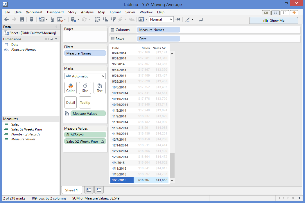
Now that I have my data laid out the way I want it, I start piecing together the steps I'll need to take to get to my final solution. First, I know I'll need to be looking a year back in my data, so I want to figure out the calculation that gets me a data point from 52 weeks back from a given row. Essentially, I want to bring the sales value from 1/26/14 ($14,852) down to the same row as my 1/25/15 sales value ($18,697). To do this, I know I need the sum of sales. I also need a way to handle NULL sales values, so I employ the ZN() function to handle NULL values as 0. Then I insert the ZN(Sum(Sales)) as the expression of the LOOKUP() and use an offset of -52, since I need to look 52 values back in my weekly date to find last year's weekly sales value.


I double click my "Sales 52 Weeks Prior" pill in the measures shelf to add it to my data table, then check if my 1/26/14 value is now showing as the 1/25/15 sales value.


It checks out! The next calculation I need is to find the 4 week moving average. I right click on the Sales pill in my Measure Values and create a table calculation. I select the Moving Calculation, summarize values using the average, moving down along the table since my dates are sorted ascending, and then look 3 values back from the current value.


One thing to point out here is that I could click "Perform a secondary calculation on the result" as seen in the below image but Tableau does not provide an option for a custom number of values to look back on, which is a big part of why I'm writing this post! I only have the previous, next, first, and last values as an option, and I need to specifically look 52 values back, so let me click out of this option and go back to the table calc above.


If I click the "Customize..." button, I can check out Tableau's automatically generated calculation based on my selections. This calculation takes the Window Average of my sales, starting 3 periods back from a given value, to the given value. I rename this calculation as the "Sales 4 Week Moving Average" to save it as a new calculated field in my measures shelf because I'll be using it again.


When I click OK, this calculation will now replace the sum(Sales) on my chart, so I go ahead and add sum(Sales) back to the table for reference. Does the moving average calculation average out the current plus last 3 weeks of sales data for a 4 week moving average? Yup!


So now what do I do? Well, let me start with what I have... I have my weekly sales, my sales from a year back, and my 4 week moving average. I now need to find a way to get my 4 week moving average from a year back.

I have an excellent head start for this, because I not only got my 4 week moving average calc working, but I also have the lookup logic to get a value from 52 weeks back. What I need to do is create a new calculation that combines the "Sales 4 Week Moving Average" logic [WINDOW_AVG(SUM([Sales]), -3, 0)] with my "Sales 52 Weeks Prior" logic [LOOKUP(zn(sum([Sales])),-52)].

This is precisely why I replace the sum([Sales]) logic in my 1 year lookback [LOOKUP(zn(sum([Sales])),-52)] with the 4 week moving average logic [WINDOW_AVG(SUM([Sales]), -3, 0)].


I add my new calculated measure "Sales 52 Weeks Prior 4 Week Moving Average" to the data table by double clicking its pill in the measures shelf. Does this show the 4 week moving average from 1 year ago on the current row? It sure does!


Now that I have the current 4 week moving average and the 4 week moving average from 52 weeks ago, I can create a calculation that takes the ( (current 4 week average) - (4 week average from 52 weeks ago) ) / (4 week average from 52 weeks ago) to find my year-over-year 4 week moving average.


( WINDOW_AVG(SUM([Sales]), -3, 0) - LOOKUP(zn(WINDOW_AVG(SUM([Sales]), -3, 0)),-52) )

/ LOOKUP(zn(WINDOW_AVG(SUM([Sales]), -3, 0)),-52)


I add this to the data table to check if works...


It works! I have just created a YoY %Diff using 4 week moving averages to show that my 1/25/15 4 week moving average is 26.86% more than the 4 week moving average from 52 weeks back! If I play around with the Show Me options, I can chart my YoY 4 week moving average against the 4 week moving average of sales as a line graph, or whatever type of visualization will help the end users make data-driven decisions.


A few gems for you to note that played an instrumental role in my ability to work through this table calc problem in Tableau:

  • Build out your base table first using dimensions and measures needed for analysis
  • Maintain a level of granularity needed for the table calcs i.e. having weekly data for a 4 week moving average calculation
  • Try to get any calculations needed on the given row it will impact i.e. bringing the 4 week moving sales average from 1/26/14 (52 weeks ago) to the row that displays 1/25/15 data
  • Create basic calculations first, then start piecing them together to achieve what you need i.e. embedding the 4 week moving average calc into the YoY calc
  • Be creative but think practically

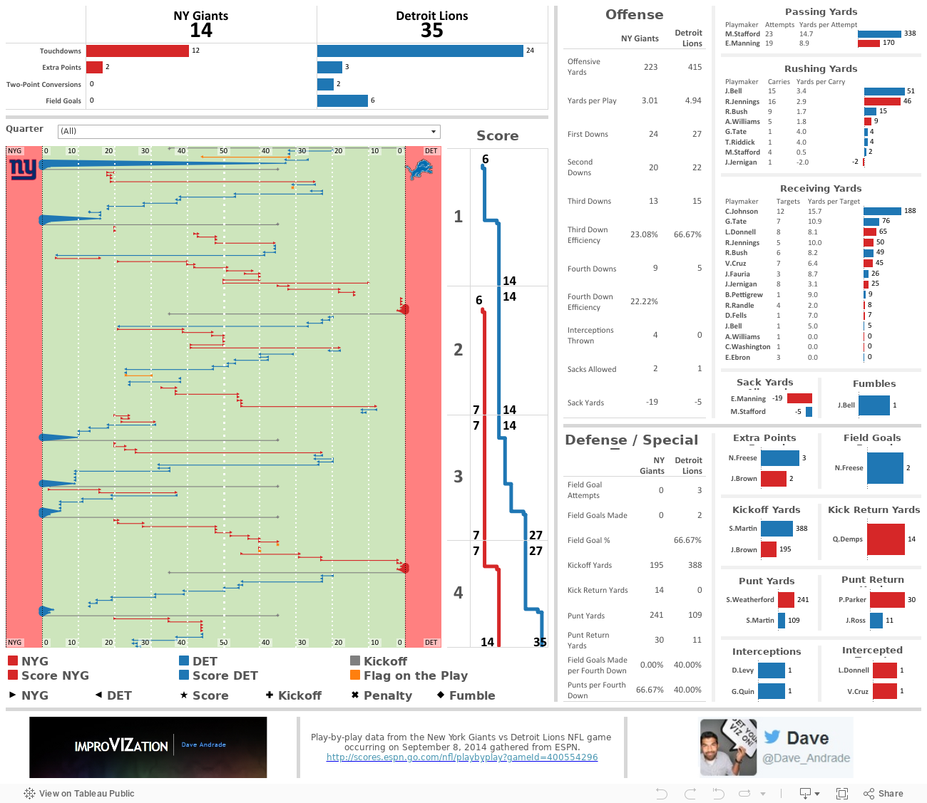
NFL Drive Analysis - Giants vs Lions

I figured I'd take the passive approach for a new blog idea and let my attention flow naturally to what's most interesting to me at the moment. With my time (and cash) vested in an office Fantasy Football league, my mind has been fixed on NFL data as of late, despite all the upstanding citizens the NFL employs.

Assault, DUIs, performance enhancing substances, shootings and murder aside, the NFL kicked off its new season last weekend. That means my fandom experience is back in full gear. Sometimes, it's great, but most of the time it's hard being a New York Giants fan. I'm referring to the NY Giants football team from the East Division of the National Football Conference (NFC) division in the National Football League (NFL). I say it can be great because we've managed to pull off (basically steal) 2 Super Bowls in the last 10 years, but most of the time it's really hard due to games like the one I begrudgingly sat through last Monday.

I digress, last Monday, while watching my beloved NY Giants [compete?] against the Detroit Lions, I saw something that I just had to try and recreate in Tableau. I set my intention to recreate a drive chart by using the play-by-play data from the game.

The play-by-play is a linear view of the game, ordered by the quarter (4 total) and time (15 minutes per quarter), and detailed with the down, 1st down yards remaining, starting field position, and play detail (players involved, play activity (pass/rush/etc), and other important details (touchdowns/penalties/etc). Here's an example from ESPN:

A very helpful view to visualize the play-by-play detail of a game is the drive chart. The drive chart shows where, on the field, the team with possession starts out and how far they make it down the field either before scoring or turning the ball over. Below is a drive chart, also from ESPN, for the 1st quarter of the game. As you can see, the Detroit Lions (in blue) dominated with 2 scoring drives while the NY Giants (in grey) were forced to turn the ball over through punting on both drives. Now, please, use your vivid imagination to picture me losing my patience and my interest in the game at this point.


I grabbed the ESPN play-by-play data and dumped it in Excel. I created two columns, one for the down detail and another for the play detail. The data looked like this after I cleaned it up a bit:


Now for the fun part! I took the down detail and play detail, extrapolated certain parts of it to new columns for a more database-friendly view of the data, and created some additional columns not provided by the play-by-play data to help me achieve what I needed to create a drive chart in Tableau. The most important new field I had to create is the "Path" field (column D). This field allows Tableau to assign the data with a start and end point for the same field. For example, rows 2 and 3 provide the same start (columns G and H) and end (columns I and J) field positions but are broken out into two separate rows that Tableau can use to reference. The starting field position (NYG 35 yard line) is assigned the path of "0" and the end field position (DET 0 yard line) is assigned the path of "1" in Tableau.


Here's where the magic happens. I have to somehow translate the available data into a start and end position on an X axis for Tableau. Tableau needs to know which side of the field belongs to NY vs Detroit, as well as what happens when the starting field position is on the NY or Detroit side. This is where my fancy calculated field comes into play. It helps Tableau identify which columns to use and what to do with the values when the path is 0 for the starting point on the field, and the same for a path of 1 for the end point on the field. I sat down with a pencil and paper to figure this one out.


Needless to say, I was pleased with the result because it factored in the full 120 yard size of the field, with each end zone having 10 yards, and it allowed me to recreate a football field in Tableau using a bunch of reference lines and bands with colors, line sizes, and shapes to indicate different activities of the play-by-play!


Now that I had that item tackled, no pun intended, I created many more calculations based on the activity/play detail/etc. Adding these proved to be difficult, especially when trying to tie my numbers with those reported by ESPN. You may see some slight differences here and there, but the general idea remains the same - the Giants got their asses handed to them by Matt Stafford and Megatron. I also added a filter across the entire dashboard for quarter (mostly to filter on the second quarter and give myself some relief that the Giants at least dominated in score, though not even offensive yards...) and used dashboard actions to make every data point interactive across all applicable charts. Here's the final product... enjoy!

World Cup 2014 Brazil GOOOALS!!!

 Well, that was fun! Anyone else feel like they're in World Cup withdrawal?

I have just the thing for you...

I was fortunate enough to catch almost every game played in the World Cup, my favorite of all sporting events. As you can tell, I'm a sucker for all the facts, stats, data, odds, visuals, blogs, coverage, memes, and general hype around this year's World Cup. There are so many fantastic websites out there that produce hours of entertainment for me. FIFA itself provided some really cool content and statistics on their website and app, while sources like The Guardian produced a flurry of facts and stats. After creating a data set that detailed each goal scored in World Cup 2014 (sans overtime penalty kicks), I decided to use Tableau v8.2's story points to help organize and visualize some of the fun facts provided by The Guardian. Check it out:

#QuantifiedSelf - I Am What I Listen To

 Hello, my name is Dave, and I'm a music addict.

In 2007, I started tracking the music I listened to through a website called Last.fm. Back then, I typically listened to music through iTunes. However, iTunes didn't provide a good historic view of all the songs I've listened to. My eclectic, offbeat taste in music combined with my inner data nerd made Last.fm a great resource to me. Over the years, I've used Last.fm to track much of the music I've listened to through my iTunes desktop application, my iPod, and now through my Spotify desktop application. The only downside is that Last.fm doesn't track music I listen to on my iPhone's Spotify app, which I tend to use quite a bit.

The next step, after tracking and storing the data, is to visualize it. And what better time to create a music data viz than #QuantifiedSelf month?! I took my data, flowed it through Tableau and came up with a visualization that encourages the exploration of my music listening habits.

A few interesting insights to point out from the 1 year look-back period shown above:

  • I typically have project huddles during the morning and try to reserve afternoons for development, which can be clearly seen in the "typical week, in songs played" heat map
  • My peak time of day to listen to music is around 3pm on Wednesday, and when clicking on this time I see I listen to a lot of punk rock, which typically has shorter song lengths, thus the higher song play count at that time
  • You can see I typically don't start listening to music until 9am, but on 3/28 I had some early morning work to do where I listened to a lot of Math Rock, a genre of asymmetric time signatures and complex rhythms, to stimulate my brain and keep me going early in the morning.
  • If you switch over to the "mood" filter, you can see I'm pretty well balanced between upbeat and relaxed music and that I've been listening to a lot more "chill" music recently. If you check out some of the chillwave bands I've been listening to, you'll see their music is perfect for warm weather - I'm ready for Summer!

Subscribe!

A few days ago, I was asked to elaborate on the capabilities and limitations of the subscription function within Tableau Server. Sure, Tableau's Online Help website has information on this subject, but I couldn't quite find everything I thought an end user would be interested in knowing in one happy place.

Some background information is that part of my job is to develop Tableau Dashboards, to do a little Server admin work, and to also demo any and all things Tableau-related. If you do any or all of the aforementioned, I think we can agree that it's important to utilize the full strength of Tableau desktop and server. But, in reality, a lot of Tableau's nifty features can get lost in a typical project. This is why I think it's important to package up as many of the cool/relevant features I can into the dashboard design itself, then demo all the extra cool "stuff" (i.e. subscriptions) the end user can do in order to create a greater sense of empowerment over the data and increase usage to drive better insights.

With that being said, this post is for you if you're:

  • developing a Tableau dashboard, publishing it to Server and would like your audience to receive your dashboard for updates
  • accessing Server to check out a few dashboards and would like to receive one or more on a regular basis
  • simply interested in a new (and super exciting) way to demo the subscription function of Tableau Server

Subscriptions allow the user to schedule an email to hit his/her inbox with an updated snapshot view of a dashboard, or even all dashboards in a workbook, that he/she would like to see on a regular basis without having to log into Tableau Server.

The subscription functionality was introduced as a new feature to Tableau Server during its v8.0 release around Q2 2013. No, this wasn't a groundbreaking innovation by Tableau, rather, a rapidly growing Tableau very wisely jumped on the subscription bandwagon. Tableau saw a large potential increase in users of Tableau Server, its means of spreading data to the masses. With many of these end users already comfortable with traditional BI tools scheduling canned reports to their respective inbox, Tableau added the subscription function to stay relevant and competitive with the plethora of BI tools already performing this task.

In an ideal world, all users log into Server to interact with the dashboards for rapid-fire insights. However, we all know a manager or two that refuses to use any technology other than their email and smart phone. This is where Tableau subscriptions come in handy; they help familiarize the typical "hands-off" user with the dashboard. And once that person starts bringing printouts of the dashboard to meetings and plugging it into PowerPoint presentations, it won't be long before the adoption curve has them logged into Server and interacting with the data - maybe even with their iPad!

Hopefully by now I've made my point as to why subscriptions can be a good thing and you now want to see a demo. Well, here's how a typical user would go about interacting with Tableau's subscription function...

Below is our "typical" dashboard view as it would appear on Server. Nothing fancy here, just a summary dashboard of some mocked up campaign performance data. Let's pretend the data presented in this dashboard is actually a live connection to a database that updates everyday at noon. We can already see some interesting data here, with performance trends and benchmarking, a top 10 chart, and a drill down chart that updates through dashboard actions. Anyone interested in viewing this information would be forced to log into our Server, find this view, and refresh it with the latest data.


At the top right, a (very small) mail icon appears next to the download link. What's interesting is that little mail icon is packed with power. Let's click on the mail icon and walk through the pop up window below... and feel free to click on the image to get a bigger view.

Step 1. Click to open subscription options.

Step 2. Check the destination email. We are able to change this. (I describe how in the "manage my subscriptions" section below)

Step 3. Edit the email subject to be something relevant. ("Overall Summary" works for me)

Step 4. Select the schedule for this dashboard to be sent. Options are controlled by the Tableau Administrator and can be customized.

Step 5. Select the content to be emailed - "This Sheet" sends only the sheet/tab/dashboard - "Sheets in Workbook" sends all dashboards within the workbook being viewed.


VoilĂ ! I have just successfully subscribed to the "Overall Summary" dashboard, with it scheduled to hit my email inbox everyday at 2:30pm. Interested in seeing what this might look like in a Microsoft Outlook inbox? Look no further...


A perfect dashboard view sitting in my inbox! Here, the email was sent by our default mail distributor we set up for our Tableau Server, called the BI Applications Team. The email was sent promptly to my inbox by 2:31pm, only 1 minute after the schedule should have began to run. If I click anywhere on the dashboard, it will bring me to the dashboard on Server, so I'd like to remind you now that this is a static, non-interactive view of the data. The benefit here is that it could be refreshed with live data if that's how the data connection is set up.

If there are tons of subscriptions the Server has to process during the same time, the Tableau Administrator is able to prioritize certain subscriptions over others to ensure key dashboards are hitting users' inboxes as soon as possible. Please work with your Admin if this is the case.

Now, let's scroll down to the bottom of the email and take a look...

What you should see is a link to "Manage my subscription settings." This comes in handy especially when you want to unsubscribe from the current dashboard, or change your subscription settings. Here's a look at what pops up on Tableau Server after you click the link and log in...

I've added in a red box to help highlight the area of focus.

  • I am free to edit the Subject of the email to be something more relevant to me.
  • I am also able to change the schedule of the email to a new option, for example I could change it to be weekly on Mondays at 9am. If I don't see an ideal option available, I can contact the Tableau Server administrator and see if he/she can include a better schedule for my dashboard.
  • I am also able to unsubscribe from my current subscription. If I click the unsubscribe button and then hit "Update," the subscription should disappear.

Oh, and one last thing, I can also update the email my subscription is delivered to in the "Change Email" section at the top of the page.

If I go back to the dashboard on Server, I'm free to create a custom view of the dashboard by clicking the filters that are most relevant to me, then saving the view to My Custom Views. For example, I clicked the "Circulation" option in the "Select a Metric to Analyze" filter and created the "Circulation" custom view below, then went through the subscription process for that view to have it hit my inbox instead of the standard view (which was originally "Demand").


Some points to call out with Tableau's subscription functionality are:

  • If there is a date filter set on the dashboard when it is published to Server, Tableau will not update the end date of that filter to reflect the current date. The only way I know how to handle this is to have someone edit the date in Tableau Desktop, then re-publish that dashboard to Server. I'd really like to see Tableau add an automatic end-date update function in the future.
  • If there are hidden tabs in a dashboard when it is published to Server, those tabs will not appear in the email subscription.
  • If there is a dashboard with many filter options, and the end user would like to see each of those filters, he/she would need to filter to each option and set a new subscription to his/her inbox.
  • Tableau does not support a wide variety of export options at the moment. Other tools allow for Excel, PDF, PowerPoint, etc. export options. Tableau only sends a PNG image hyper-linked to the dashboard view on Server.

If you have any other points I haven't called out here, please feel free to comment and I'll add it to the list. Thanks for reading!