NFL Drive Analysis - Giants vs Lions

I figured I'd take the passive approach for a new blog idea and let my attention flow naturally to what's most interesting to me at the moment. With my time (and cash) vested in an office Fantasy Football league, my mind has been fixed on NFL data as of late, despite all the upstanding citizens the NFL employs.

Assault, DUIs, performance enhancing substances, shootings and murder aside, the NFL kicked off its new season last weekend. That means my fandom experience is back in full gear. Sometimes, it's great, but most of the time it's hard being a New York Giants fan. I'm referring to the NY Giants football team from the East Division of the National Football Conference (NFC) division in the National Football League (NFL). I say it can be great because we've managed to pull off (basically steal) 2 Super Bowls in the last 10 years, but most of the time it's really hard due to games like the one I begrudgingly sat through last Monday.

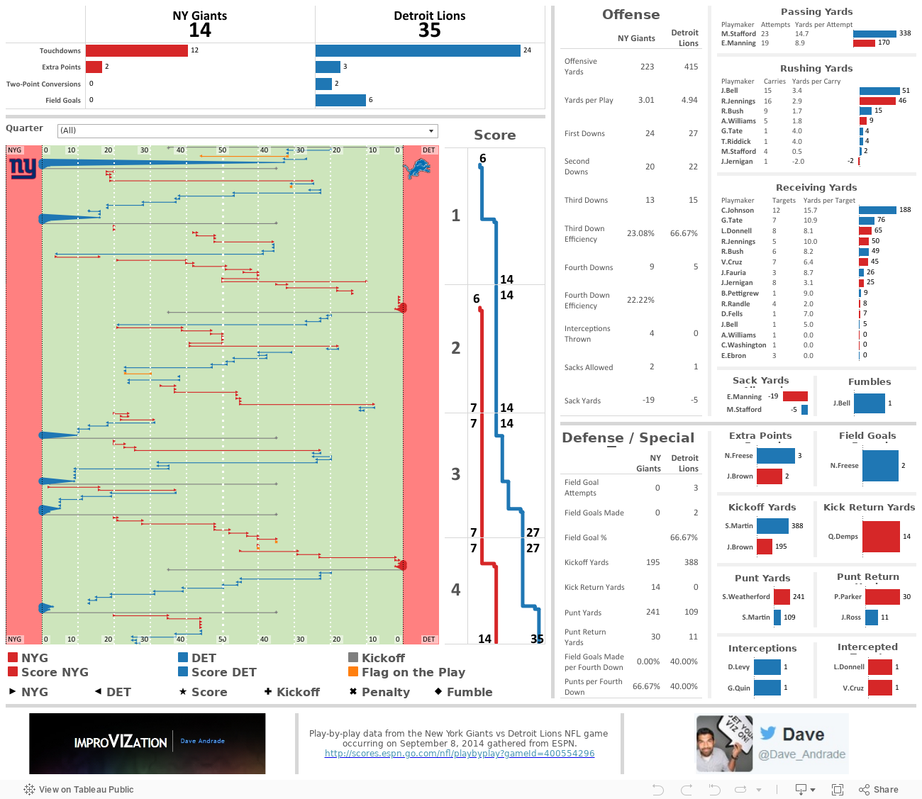
I digress, last Monday, while watching my beloved NY Giants [compete?] against the Detroit Lions, I saw something that I just had to try and recreate in Tableau. I set my intention to recreate a drive chart by using the play-by-play data from the game.

The play-by-play is a linear view of the game, ordered by the quarter (4 total) and time (15 minutes per quarter), and detailed with the down, 1st down yards remaining, starting field position, and play detail (players involved, play activity (pass/rush/etc), and other important details (touchdowns/penalties/etc). Here's an example from ESPN:

A very helpful view to visualize the play-by-play detail of a game is the drive chart. The drive chart shows where, on the field, the team with possession starts out and how far they make it down the field either before scoring or turning the ball over. Below is a drive chart, also from ESPN, for the 1st quarter of the game. As you can see, the Detroit Lions (in blue) dominated with 2 scoring drives while the NY Giants (in grey) were forced to turn the ball over through punting on both drives. Now, please, use your vivid imagination to picture me losing my patience and my interest in the game at this point.


I grabbed the ESPN play-by-play data and dumped it in Excel. I created two columns, one for the down detail and another for the play detail. The data looked like this after I cleaned it up a bit:


Now for the fun part! I took the down detail and play detail, extrapolated certain parts of it to new columns for a more database-friendly view of the data, and created some additional columns not provided by the play-by-play data to help me achieve what I needed to create a drive chart in Tableau. The most important new field I had to create is the "Path" field (column D). This field allows Tableau to assign the data with a start and end point for the same field. For example, rows 2 and 3 provide the same start (columns G and H) and end (columns I and J) field positions but are broken out into two separate rows that Tableau can use to reference. The starting field position (NYG 35 yard line) is assigned the path of "0" and the end field position (DET 0 yard line) is assigned the path of "1" in Tableau.


Here's where the magic happens. I have to somehow translate the available data into a start and end position on an X axis for Tableau. Tableau needs to know which side of the field belongs to NY vs Detroit, as well as what happens when the starting field position is on the NY or Detroit side. This is where my fancy calculated field comes into play. It helps Tableau identify which columns to use and what to do with the values when the path is 0 for the starting point on the field, and the same for a path of 1 for the end point on the field. I sat down with a pencil and paper to figure this one out.


Needless to say, I was pleased with the result because it factored in the full 120 yard size of the field, with each end zone having 10 yards, and it allowed me to recreate a football field in Tableau using a bunch of reference lines and bands with colors, line sizes, and shapes to indicate different activities of the play-by-play!


Now that I had that item tackled, no pun intended, I created many more calculations based on the activity/play detail/etc. Adding these proved to be difficult, especially when trying to tie my numbers with those reported by ESPN. You may see some slight differences here and there, but the general idea remains the same - the Giants got their asses handed to them by Matt Stafford and Megatron. I also added a filter across the entire dashboard for quarter (mostly to filter on the second quarter and give myself some relief that the Giants at least dominated in score, though not even offensive yards...) and used dashboard actions to make every data point interactive across all applicable charts. Here's the final product... enjoy!
World Cup 2014 Brazil GOOOALS!!!

 Well, that was fun! Anyone else feel like they're in World Cup withdrawal?

I have just the thing for you...

I was fortunate enough to catch almost every game played in the World Cup, my favorite of all sporting events. As you can tell, I'm a sucker for all the facts, stats, data, odds, visuals, blogs, coverage, memes, and general hype around this year's World Cup. There are so many fantastic websites out there that produce hours of entertainment for me. FIFA itself provided some really cool content and statistics on their website and app, while sources like The Guardian produced a flurry of facts and stats. After creating a data set that detailed each goal scored in World Cup 2014 (sans overtime penalty kicks), I decided to use Tableau v8.2's story points to help organize and visualize some of the fun facts provided by The Guardian. Check it out:

#QuantifiedSelf - I Am What I Listen To

 Hello, my name is Dave, and I'm a music addict.

In 2007, I started tracking the music I listened to through a website called Last.fm. Back then, I typically listened to music through iTunes. However, iTunes didn't provide a good historic view of all the songs I've listened to. My eclectic, offbeat taste in music combined with my inner data nerd made Last.fm a great resource to me. Over the years, I've used Last.fm to track much of the music I've listened to through my iTunes desktop application, my iPod, and now through my Spotify desktop application. The only downside is that Last.fm doesn't track music I listen to on my iPhone's Spotify app, which I tend to use quite a bit.

The next step, after tracking and storing the data, is to visualize it. And what better time to create a music data viz than #QuantifiedSelf month?! I took my data, flowed it through Tableau and came up with a visualization that encourages the exploration of my music listening habits.

A few interesting insights to point out from the 1 year look-back period shown above:

  • I typically have project huddles during the morning and try to reserve afternoons for development, which can be clearly seen in the "typical week, in songs played" heat map
  • My peak time of day to listen to music is around 3pm on Wednesday, and when clicking on this time I see I listen to a lot of punk rock, which typically has shorter song lengths, thus the higher song play count at that time
  • You can see I typically don't start listening to music until 9am, but on 3/28 I had some early morning work to do where I listened to a lot of Math Rock, a genre of asymmetric time signatures and complex rhythms, to stimulate my brain and keep me going early in the morning.
  • If you switch over to the "mood" filter, you can see I'm pretty well balanced between upbeat and relaxed music and that I've been listening to a lot more "chill" music recently. If you check out some of the chillwave bands I've been listening to, you'll see their music is perfect for warm weather - I'm ready for Summer!

Subscribe!

A few days ago, I was asked to elaborate on the capabilities and limitations of the subscription function within Tableau Server. Sure, Tableau's Online Help website has information on this subject, but I couldn't quite find everything I thought an end user would be interested in knowing in one happy place.

Some background information is that part of my job is to develop Tableau Dashboards, to do a little Server admin work, and to also demo any and all things Tableau-related. If you do any or all of the aforementioned, I think we can agree that it's important to utilize the full strength of Tableau desktop and server. But, in reality, a lot of Tableau's nifty features can get lost in a typical project. This is why I think it's important to package up as many of the cool/relevant features I can into the dashboard design itself, then demo all the extra cool "stuff" (i.e. subscriptions) the end user can do in order to create a greater sense of empowerment over the data and increase usage to drive better insights.

With that being said, this post is for you if you're:

  • developing a Tableau dashboard, publishing it to Server and would like your audience to receive your dashboard for updates
  • accessing Server to check out a few dashboards and would like to receive one or more on a regular basis
  • simply interested in a new (and super exciting) way to demo the subscription function of Tableau Server

Subscriptions allow the user to schedule an email to hit his/her inbox with an updated snapshot view of a dashboard, or even all dashboards in a workbook, that he/she would like to see on a regular basis without having to log into Tableau Server.

The subscription functionality was introduced as a new feature to Tableau Server during its v8.0 release around Q2 2013. No, this wasn't a groundbreaking innovation by Tableau, rather, a rapidly growing Tableau very wisely jumped on the subscription bandwagon. Tableau saw a large potential increase in users of Tableau Server, its means of spreading data to the masses. With many of these end users already comfortable with traditional BI tools scheduling canned reports to their respective inbox, Tableau added the subscription function to stay relevant and competitive with the plethora of BI tools already performing this task.

In an ideal world, all users log into Server to interact with the dashboards for rapid-fire insights. However, we all know a manager or two that refuses to use any technology other than their email and smart phone. This is where Tableau subscriptions come in handy; they help familiarize the typical "hands-off" user with the dashboard. And once that person starts bringing printouts of the dashboard to meetings and plugging it into PowerPoint presentations, it won't be long before the adoption curve has them logged into Server and interacting with the data - maybe even with their iPad!

Hopefully by now I've made my point as to why subscriptions can be a good thing and you now want to see a demo. Well, here's how a typical user would go about interacting with Tableau's subscription function...

Below is our "typical" dashboard view as it would appear on Server. Nothing fancy here, just a summary dashboard of some mocked up campaign performance data. Let's pretend the data presented in this dashboard is actually a live connection to a database that updates everyday at noon. We can already see some interesting data here, with performance trends and benchmarking, a top 10 chart, and a drill down chart that updates through dashboard actions. Anyone interested in viewing this information would be forced to log into our Server, find this view, and refresh it with the latest data.


At the top right, a (very small) mail icon appears next to the download link. What's interesting is that little mail icon is packed with power. Let's click on the mail icon and walk through the pop up window below... and feel free to click on the image to get a bigger view.

Step 1. Click to open subscription options.

Step 2. Check the destination email. We are able to change this. (I describe how in the "manage my subscriptions" section below)

Step 3. Edit the email subject to be something relevant. ("Overall Summary" works for me)

Step 4. Select the schedule for this dashboard to be sent. Options are controlled by the Tableau Administrator and can be customized.

Step 5. Select the content to be emailed - "This Sheet" sends only the sheet/tab/dashboard - "Sheets in Workbook" sends all dashboards within the workbook being viewed.


VoilĂ ! I have just successfully subscribed to the "Overall Summary" dashboard, with it scheduled to hit my email inbox everyday at 2:30pm. Interested in seeing what this might look like in a Microsoft Outlook inbox? Look no further...


A perfect dashboard view sitting in my inbox! Here, the email was sent by our default mail distributor we set up for our Tableau Server, called the BI Applications Team. The email was sent promptly to my inbox by 2:31pm, only 1 minute after the schedule should have began to run. If I click anywhere on the dashboard, it will bring me to the dashboard on Server, so I'd like to remind you now that this is a static, non-interactive view of the data. The benefit here is that it could be refreshed with live data if that's how the data connection is set up.

If there are tons of subscriptions the Server has to process during the same time, the Tableau Administrator is able to prioritize certain subscriptions over others to ensure key dashboards are hitting users' inboxes as soon as possible. Please work with your Admin if this is the case.

Now, let's scroll down to the bottom of the email and take a look...

What you should see is a link to "Manage my subscription settings." This comes in handy especially when you want to unsubscribe from the current dashboard, or change your subscription settings. Here's a look at what pops up on Tableau Server after you click the link and log in...

I've added in a red box to help highlight the area of focus.

  • I am free to edit the Subject of the email to be something more relevant to me.
  • I am also able to change the schedule of the email to a new option, for example I could change it to be weekly on Mondays at 9am. If I don't see an ideal option available, I can contact the Tableau Server administrator and see if he/she can include a better schedule for my dashboard.
  • I am also able to unsubscribe from my current subscription. If I click the unsubscribe button and then hit "Update," the subscription should disappear.

Oh, and one last thing, I can also update the email my subscription is delivered to in the "Change Email" section at the top of the page.

If I go back to the dashboard on Server, I'm free to create a custom view of the dashboard by clicking the filters that are most relevant to me, then saving the view to My Custom Views. For example, I clicked the "Circulation" option in the "Select a Metric to Analyze" filter and created the "Circulation" custom view below, then went through the subscription process for that view to have it hit my inbox instead of the standard view (which was originally "Demand").


Some points to call out with Tableau's subscription functionality are:

  • If there is a date filter set on the dashboard when it is published to Server, Tableau will not update the end date of that filter to reflect the current date. The only way I know how to handle this is to have someone edit the date in Tableau Desktop, then re-publish that dashboard to Server. I'd really like to see Tableau add an automatic end-date update function in the future.
  • If there are hidden tabs in a dashboard when it is published to Server, those tabs will not appear in the email subscription.
  • If there is a dashboard with many filter options, and the end user would like to see each of those filters, he/she would need to filter to each option and set a new subscription to his/her inbox.
  • Tableau does not support a wide variety of export options at the moment. Other tools allow for Excel, PDF, PowerPoint, etc. export options. Tableau only sends a PNG image hyper-linked to the dashboard view on Server.

If you have any other points I haven't called out here, please feel free to comment and I'll add it to the list. Thanks for reading!

NBC Olympics' [Doh!]nut Chart

Take a moment and look at the NBC Olympics page (screenshot below). What do you see? What impressions do you get from what you see? What questions pop into your head about what you see? What conclusions can you make from what you see?

For me, I see a classic mistake. I see an unnecessary, misleading visualization. I see... a doughnut chart. Doh!

What bugs me about this visualization is that everything I need to walk away with some insight is written out in the middle of each doughnut, or circle. Let's have a little exercise, shall we?

Which country has the most total medals? Norway has 11 total medals.

How does the next country compare? Canada has 9 total medals.

How many of each medal has each country earned? Norway has 4 gold medals and 3 silver medals and Canada has earned the same. In fact, where Norway beats Canada in the race for total medals is in bronze medals, where it picked up 4 while Canada has only earned 2.

Ok, I'm satisfied with the information I've received. The data in the center of each doughnut helped answered my questions about the top 2 countries with the most medals, the total medal gap between the two countries, and what is causing the gap.

If this is the information I need, then why am I presented with the surrounding doughnut chart? Is it because it looks cool? Is it because doughnuts are undeniably tasty? Let's think about what happens when we remove the data in the center of each doughnut.

Without the data in the center of each chart, I have 3 big, distracting doughnuts with gold, silver, and bronze slices. Canada's gold and silver slices are bigger than Norway's. Conclusion, Canada has more gold and silver medals than Norway, obviously making Canada a better performer than Norway. Then why is Canada in 2nd place?

Doughnut charts offer a good look at how proportions factor into a total distribution. In this case, Canada is actually doing better than Norway in the proportion of gold and silver medals it has earned. But who really cares about this fact? This is the Olympics, for crying out loud, where total medals are what counts, not the proportion of medals a country has earned.

To give the NBC Olympics' page some credit, they allow the user to view the data through a stacked bar chart, which is how I'd prefer to view the data. Not only do I get a clear sense of the total medals, I also have a proportional view of the gold, silver, and bronze medal counts for each country. All that anxiety about doughnuts just to get what I was looking for one mouse scroll below...


Thanks for reading and I hope you all noticed the ridiculous McDonald's ad on each side of the page, which tries to equate eating a chicken mcnugget to biting down on an Olympic gold medal. All I can say is that I hope those mcnuggets taste better than that lousy 3-toned doughnut...